Kitchen Paint Colors: Best Whites, Warm Grays, and Greens for 2026
Choosing kitchen paint colors: you want them to look stylish, but that is only part of what to consider. This is the room where you

Choosing kitchen paint colors: you want them to look stylish, but that is only part of what to consider. This is the room where you cook, gather as a family, host Sunday night dinner, and probably drink your morning coffee, so the color sets the tone for the whole house.
The good news is you have options for every style of kitchen, from clean whites to warm grays to soft, earthy greens, and Vista Paint’s palette runs more than 1,300 shades deep. The trick is finding that perfect hue that matches the room, the lighting, and your cabinets.
Here’s how to narrow it down.
Picking a color for a kitchen goes beyond looking good, they also needs to hold up to the wear and tear of being in a kitchen, from steam and splatter from cooking to the daily fingerprints from your children.
Another thing to remember: light changes constantly, so a shade that looks perfect at noon can turn muddy by dinner. Your walls also complement the other finishes in the kitchen, including cabinets, countertops, backsplash tile, maybe stainless appliances too.
The paint finish matters as much as the shade itself. A scrubbable, durable paint like those in Vista Paint’s Carefree Line lets you wipe away marinara splatter without needing a touch-up. To avoid any painting regrets, choose the sheen first, then the shade.
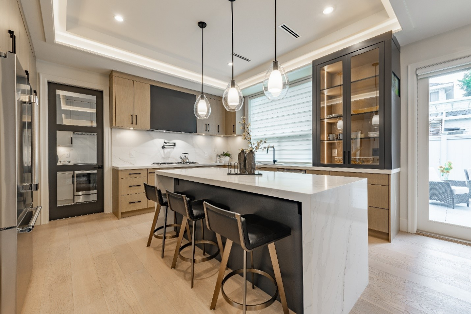
White has always been the default kitchen color as it bounces light around, makes smaller spaces feel bigger, and gives you total freedom with cabinets and hardware. But not all whites are the same, and picking the right white can be tricky.
Never forget the undertones and browse the full Whites collection and then order a few chips to tape up next to your cabinets to help you decide.
Warm gray is a beautiful alternative to a straight gray. The beige undertones keep it cozy under warm kitchen lighting. Many paint brands have built famous names around this shade family, and should you love one of them, Vista Paint carries comparable options.
One of the best reasons for choosing greige is how well it works with white cabinets and wood tones.
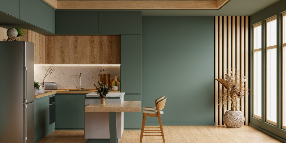
For those who want something more than a basic white or gray kitchen, sage and muted green kitchens are great options. Green gives the kitchen a connection to nature, which calls to many chefs and home cooks who handle fresh food every day.
Browse the full Greens and Blues collections to see the whole range.
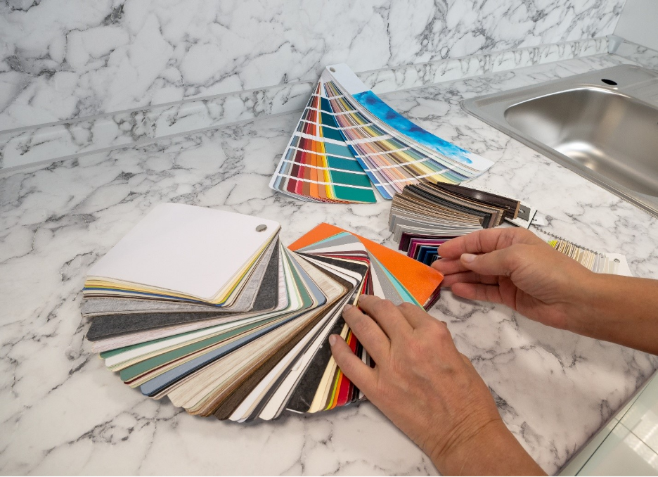
If you have a small kitchen or don’t have a lot of natural sunlight, choosing a bright color is a must. To start, consider the light reflectance value, or LRV. This measures how much light a color bounces back on a scale of 0 to 100. If you are painting a dim kitchen, make sure to keep the LRV above 70. Avoid anything below 50, as it will soak up what little light you have.
One more quick tip: always test your swatch on two different walls. The best places are the wall facing the window, and the wall beside it, as different locations can make the paint look like a different color. Also, check the paint at different times of the day, including the morning and again at night.
If you’re painting cabinets along with the wall, the two-tone works perfectly. Choose a deeper shade on lower cabinets, something lighter up top or on the walls. Just make sure the undertones are complementary. A warm greige wall next to a cool gray cabinet will always look slightly off, even if you can’t name why.
For trim and ceilings, pick one white and use it everywhere to tie the room together. Vista Paint’s color palette page has a compare tool that lets you view two shades side by side, which makes undertone-matching much easier.
What Is the Most Popular Kitchen Paint Color?
Warm grays, greige, and soft whites are among the top choices. Colors like Lady Nicole 0030 stay neutral enough to work with almost any cabinet or counter.
What Paint Finish Is Best for Kitchen Walls?
Satin or eggshell finishes are often the right balance for resisting moisture and wiping clean without the shine of semi-gloss, which is better saved for cabinets and trim.
Should Kitchen Walls Be Lighter or Darker Than Cabinets?
There’s no hard-and-fast rule, but lighter walls with deeper cabinets are a good idea in smaller kitchens to keep the space from feeling tiny and closed off. Only choose darker walls when you have generous natural light and lighter cabinetry to balance them.
How Do I Test a Paint Color Before Committing?
The best option is to order physical color chips or paint a large swatch on two different walls, then check it in morning and evening light.
Sources:
Bob Vila, “How to Choose a Paint Finish”: https://www.bobvila.com/articles/2253-how-to-choose-a-paint-finish/
Choosing kitchen paint colors: you want them to look stylish, but that is only part of what to consider. This is the room where you

Choosing a paint color can seem like a simple decision when you are looking to remodel a room or are moving into a new house.

Paint can transform your home by creating a beautiful accent wall, increasing the curb appeal of your property, or just giving a room a fresh
Choosing kitchen paint colors: you want them to look stylish, but that is only part of what to consider. This is the room where you
Choosing a paint color can seem like a simple decision when you are looking to remodel a room or are moving into a new house.