
How to Pick the Perfect Paint Color for Any Room
Choosing a paint color can seem like a simple decision when you are looking to remodel a room or are moving into a new house.
Choosing a paint color can seem like a simple decision when you are looking to remodel a room or are moving into a new house. The trouble comes when you’re standing in front of a wall of swatches, second-guessing every shade. Should you choose a warm or cool color? Will this “soft gray” turn blue once it’s on the wall? Will it clash with the couch?
When it comes down to it, picking the right color isn’t about luck or a good eye. Here are a few ways to decide on a color you’ll still love after it’s dried on the wall.

It might seem like working backwards, but the paint should be one of the last things you choose when designing a room. When you’re repainting a room in your current home, odds are the carpet, rugs, furniture, and other items will remain, so the paint should complement these.
This can work to your advantage as you can find your favorite piece in the room and use it as your anchor. Maybe you have a navy and rust-patterned rug anchoring the living room, which you plan to keep. Instead of guessing at a wall color from scratch, you can pull the soft cream from the rug’s background, and instantly, you have a shade that already plays nice with what’s in the room.
One side note, you won’t need to sort through hundreds of paint samples to find the match, as any reputable paint store can color-match almost anything you bring in, whether it’s a throw pillow off the couch, a bathroom tile, or a small section of beloved quilt your grandmother made.
It’s not a myth that color can completely change the mood of a room and how it feels when you and your family walk in. That should be one of the first things you consider before you start grabbing swatches.
Here are a few examples and suggestions:
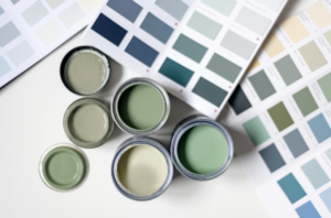
Undertones are often forgotten about when choosing lighter tones. For example, a “neutral” gray can lean blue, green, purple, or even pink. Two whites that look pretty much the same on the sample can look completely different once they’re on the wall and completely dry.
One way to find the perfect shade is to hold the swatch next to the items already in your room. It could be the floor, trim, or tile. It will be pretty obvious if the undertone works with the room and décor.
Consider a warm gray that, on the swatch, looks like the perfect soft neutral. Then, during the mid-afternoon, and being on a south-facing wall, it has a green tint.
Another example is painting a trim that seems to be a basic white, and then it looks yellowish next to the bright white ceiling. Always consider the surroundings.
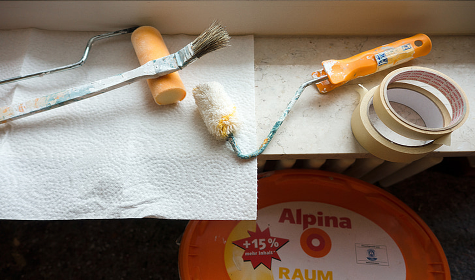
When you have narrowed down your choice, make sure to grab a sample of each color. Paint samples rarely look the same at home. They’re tiny, and the fluorescent store lighting is nothing like your house.
Here’s how to do it right:
Designers live by the 60-30-10 rule because it just works for making a balanced room.
You can follow these rules loosely, as exact percentages aren’t necessary, and the room colors will balance out.
For the most part, people don’t want the entire house painted the same color. However, each room should flow into the next and not look like a different house in each room.
Keep the undertones consistent, warm with warm and cool with cool, then use one neutral on your trim, doors, and hallways to tie everything together. Imagine a hallway that connects a warm-toned bedroom wing to a cool-toned living area, with a neutral trim color throughout the entire hall.
Should I paint the ceiling the same color as the walls?
It depends on the look and feel of the room you are painting. A ceiling a few shades lighter than your wall color tends to look better than a stark white ceiling against a bold wall. White ceilings can feel like they’re floating.
How many colors should I use in one room?
Three or fewer for the main palette is best. If you have more than that, it can make the room look like a mashup of too many things. Don’t forget about the 60-30-10 rule.
Do dark colors make a room feel smaller?
Yes, they can, but this is not always a bad thing. Dark colors make a space feel cozier and more intimate. Many people might like this for a bedroom or a cozy reading nook.
Should the trim and walls be painted the same color?
This one is a matter of opinion. Contrasting trim (usually white or a soft neutral) makes the architecture pop. By contrast, same-color trim works for a sleek, modern look.
Is it a mistake to go with a trending color?
Use trends for inspiration, sure, but they move fast. Pick something you actually love and that fits your space. A color you’re lukewarm on is just a paint job you’ll redo in two years.
Sources:
This Old House – https://www.thisoldhouse.com/painting/21015206/how-to-choose-the-right-colors-for-your-rooms
House Beautiful – https://www.housebeautiful.com/design-inspiration/a71284635/60-30-10-color-rule/
Choosing a paint color can seem like a simple decision when you are looking to remodel a room or are moving into a new house.

Paint can transform your home by creating a beautiful accent wall, increasing the curb appeal of your property, or just giving a room a fresh
Have you ever found yourself getting dizzy from the smell of paint? Well it turns out, there’s a reason why. Many people experience headaches, dizziness,
Choosing a paint color can seem like a simple decision when you are looking to remodel a room or are moving into a new house.
Paint can transform your home by creating a beautiful accent wall, increasing the curb appeal of your property, or just giving a room a fresh